Pages

Sunday, October 28, 2012

Hangin' Tough

Oh, NKOTB, those were the days.  Are you singing along in your head?  Personally, I'm having flashbacks of the roller rink.  Anyhow...last year, Seth and I discovered cardboardsafari.com and became the proud owners of Fred (the large moose trophy) and Robbie Jr. (the medium rhino trophy).  Fred used to hang in our living room and Robbie Jr was in our guest bath.


I've been contemplating where they will make their home in the new house.  I'm still not 100% sure where Robbie Jr will end up, but I fell in love with the pic below and I knew that I wanted Fred to hang above our fireplace.  

houzz.com

Large frames like this are expensive.  So, I decided to make my own.  I mean, how hard can that be really?  I bought a 10 foot long piece of molding that had already been primed at Lowe's for $10.  I cut it into 30" pieces with 45 degree angles so that the pieces would fit together into a square frame.  


What I didn't do was cut perfect 45 degree angles.  :(  When I started assembling it with some corner brackets, the cut edges were not sitting perfectly flush.  I tried sanding, reassembling, sanding some more, reassembling again, cursing, wood filler, more cursing, etc but it just wasn't going to work out for me.  I guess I just can't saw properly.


So after hours of grueling work trying to make my money-saving idea come to fruition, I drove to Hobby Lobby and got a 2'x3' frame at 50% off.  I spent less than $20. Hmmmm....I probably should have just done that in the beginning.  Making frames apparently takes some talent that I just don't possess.  Oh, well.  Lesson learned.  Maybe it will be salvageable for another project.

I spray painted my new frame a nice silvery gold color.  It came with cardboard which I wrapped with some orange fabric.  I used double sided tape to secure the fabric to the back of the cardboard.  


A masonry bit and some tapcon concrete anchors allowed us to make sure that Fred wouldn't fall to an untimely death (this is where the blog title comes into play in case you were wondering).  We used the 1-1/4" length to hang the frame and a longer 2-1/4" length anchor going through the fabric and cardboard and into the mortar to hold Fred.  (I didn't want to hang Fred directly to the fabric as I feared that his weight would noticeably pull it and that he wouldn't be super secure that way.)


We used some frog tape to help us visualize our future mantel so that we could be sure we hung Fred and his frame at the proper height.  And here is Fred in all his glory watching over the living room.  I feel so much safer now.  ;)


 Just in case that didn't satisfy you, here are more views of Fred from different angles.


I think everyone needs a cardboard moose trophy.  Or at least some sort of fake animal trophy.  Check out West Elm and Z Gallerie for some non-cardboard options.  

Is anyone else in love with fake animal trophies?  Or maybe they just creep you out?  (I'm not sure how our guests felt about being watched by Robbie Jr while they were using the lavatory.  Maybe I'll ask them one day.)

Tuesday, October 23, 2012

What's New Underfoot?

I'll tell you.  Over the past few months, we have added three new rugs to our family.  I thought I'd give you a peek at these new additions.  You may remember that I already revealed our new dining room rug in this post.  Here he is in place.  Isn't he handsome? (Yes, I am aware that I randomly assign a gender to things in our home.)


Since we are leaving the leaf in our table at all times now that we have a l...o...n...g dining room (ie what was meant to be used as a formal living room), we needed a larger rug.  Our previous dining room rug was 8'x10' and just wasn't going to cut it.  I plan to purchase some nice upholstered (maybe wingback?) chairs for the head and foot of the table one day so I wanted to make sure that I found a rug that would accommodate my future plans for the space.  I'm not going to lie.  Splurging for a 9'x12' rug was painful. Large, decent quality rugs just aren't cheap.  But when West Elm had their 20% off rug sale and I used a 10% off coupon on top of that, the pain eased some.  I'm very happy with my decision.  The rug is colorful and modern.  It's also hooked wool instead of tufted making it easier to slide the chairs in and out and reducing shedding.  

We also added a new living room rug.  Our old living room rug is a 5'x8' citron-colored dhurrie (also from West Elm) that is now brightening up our home office.  I have plans for pops of color and pattern in the form of throw pillows and possibly new upholstered chairs, so I envisioned a solid colored rug.  Our first purchase was this rug from Overstock.  When it arrived, it was a bit darker than I expected.  The color and the corduroy-like ridges just screamed 70s to me.  It had to go.  Our second purchase was another Overstock find and thankfully, it is here to stay. 


I love how the rug is variegated and its color changes a bit in different light.  The rug is interesting while still reading neutral.  Seth and I purchased a new sofa three weeks ago (ahhh....and I wish it would just get here already) that will be covered in a dark gray fabric and I think it will go just splendidly with our new rug.  

Our third rug purchase (also from Overstock) was for the first guest bedroom.  As I mentioned in this post, I decided on a yellow/white/gray color scheme for this room.  So when I saw this rug, I was hooked (pun intended).  


As you can see, the rug is gray and ivory.  It's difficult, dare I say impossible?, to find a rug with true white in it.  It is bothering me a little how white the bookcase and duvet appear when compared to the rug, but I'll get over it.   I think once the room is finished, it will all come together okay.  

Now, the only other spots that need rugs are the entryway (I'm thinking an indoor/outdoor rug like this one for durability) and our back guest bedroom.  Whew.  I guess when you have a house with hardwood and tile throughout you are forced to invest in a lot of area rugs.  

Thursday, October 18, 2012

"New" Living Room Chandeleir

Similar to my old brass light redo for our walk-in closet, I recently spray painted another brass fixture for our living room.  It used to hang in our dining room (now the office).


After removing the lovely gingham shades, I spray painted that baby white.  I chose white since there will be lots of other color in our living room (ahhh...the suspense) and I wanted the chandelier to blend in versus draw your eye to it/compete with the other pops of color.  
So, similar to last time, I used a cardboard box to contain most of the overspray. 


I used some satin finish white spray paint.  I believe it was Rustoleum.  It said paint and primer in one or something like that on the bottle.  If I wasn't lazy, I'd go out into the carport and snap a picture for you.  I haven't yet noticed a huge difference with brands, but maybe as I tackle more projects I'll form a strong love for a certain brand.  If so, I'll be sure to let you know.  As with all spray painting projects, the most important thing is to make sure that you keep the can moving and apply many thin coats.  I have little patience and have made the mistake of applying it too thick which resulted in pooling and dripping. I have to remind myself that it is okay if I can still see the original finish after the first or even the second coat.


After about 4-5 thin coats, she was lookin' good.  Seth hung her in the living room last week.  He even installed a dimmer for her so that we can set the mood light for movie watching.  :)


I still need to touch up the ceiling a bit, but it looks soooo much better than the outdated fan!  Yay!

Tuesday, October 16, 2012

Five Small Touches of Fall

I apologize for the decline in regular posting lately.  There are some projects in the works that I should be able to share soon.  I guess I am good at starting things but not always finishing them in a timely manner.  For now, I wanted to share a few more things I've done around the house to add small touches of Fall.

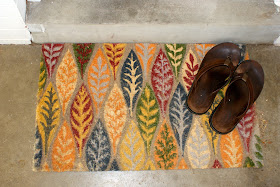
First, I found this doormat at Target a few weeks ago and just could not pass it up.  The size was too small for our front entry, but it works great at our back door leading out to the carport.


It makes me happy every time I see it.  I think it's the colors and the leaf motif.  It just screams fun Fall decor to me.  And it doesn't hurt that it color coordinates with the door fulfilling my strange need for things to match (which I am trying to let go of slowly).

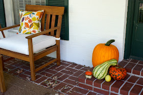
Secondly, Seth and I bought some pumpkins at the local farmer's market a few weeks ago to put on the front porch.  It's nothing too fancy - we decided to keep it simple this year.


Maybe next year when we are more settled, we can spice it up a bit.  I think some height would definitely help so I'll have to be on the lookout for something to fulfill that need. Maybe some old crates or a discounted garden stool.  I also like the idea of spooky decor. Nothing with blood and guts but just a good amount of eeriness (is that a word?).  I like these ideas below that I found on Pinterest.  I think next year I'll try a raven/spider/insect theme.  


Third are a couple of new pillows I found on Overstock.  I got them for two reasons - 1) they have more Fall colors in them than our blue and green ones and 2) one of the colors in the fabric will surely coordinate with whatever color we finally decide to paint our front door (again with the matchy, matchy - it's a sickness).  


Fourth - I created a Fall tablescape.  Again, nothing too fancy.  I started with a burlap runner that I picked up last month on a visit to Collierville and some candlesticks and vases that I already had from West Elm.  I added some new green taper candles from Wal-Mart, some branches from one of our oak trees whose leaves had started to turn, a couple of orange owls that I picked up at Kohl's for 65% off and then another 20% off with my coupon, and some fake pumpkins that I found at Jo-Ann's and spray painted white and silver.


I guess I could have moved that step stool in the background.  But, hey, I'm keeping it real here.  This is how we are living - with boxes, tools, step stools, and bubble wrap all over the place.  

And....fifth.  While at the farmer's market this past weekend, Seth and I picked up a huge mum and a couple more pumpkins to dress up the mailbox a bit.  


Not a great pic with that shadow.  I said I was working on my photography but I didn't say I could control the sun. Eventually, I will learn what time of day I need to photograph each part of our house and yard to get the best lighting but I'm not there quite yet.  

So, with some simple, inexpensive additions we have added a bit more seasonal charm in our house.  It doesn't look like we're going to get a fireplace mantel installed before the end of October.  Maybe I'll be able to create a Thanksgiving mantel.  OH - and also for me a huge part of the holidays are the smells.  I bought the Apple Pumpkin fragrance from Yankee Candle (go to Bed, Bath and Beyond and use a 20% off coupon) and it is divine.  It makes our house smell just like Fall.  

What do you guys do to spruce up your home for Fall?  Do you have a favorite candle or fragrance that you use during this season?  Anybody decorating their porch with insects or ravens?

Tuesday, October 9, 2012

How We Deal with Paper Clutter

Seth and I recently got around to setting up our office organization system in the new house so I thought I'd share it with you.  For months in our first house, we used the dining room table as our "drop zone" and it was constantly cluttered with mail and receipts. If guests were coming over, we would scurry around trying to recycle, file, and shred as necessary until the mountain of paper was cleared and we could let people in the house sans embarrassment.  I'm pretty sure that the inspiration for our system came from Better Homes and Gardens, but when I try to find it on their website, I can't.  I saved the pages that I ripped out of the magazine for awhile, but I have since thrown them away.  Oh, well.


There are a two basic components to our mail organization system (I'll get to what we do with our receipts in a bit) - our "inbox" and our "action files".  The inbox is pretty self-explanatory.  All of our mail goes into our inbox.  Sometimes we are busy and every item of mail from that day goes into the inbox without a second glance.  Other times we sort through it and recycle the junk mail before placing the rest of it inside the inbox.


Multiple times a week we go through the inbox and place everything into one of our action files.  These are labelled "do now", "do later", "pending", and "file".  
  • Do Now - Items here are things that need attention within the week.  This file should be checked multiple times a week.
  • Do Later - Items in this file are things that need attention within the month.  It should be checked weekly and items transferred to the Do Now file as needed.
  • Pending - Items in this file are things for which we are awaiting a response (ex. rebates that we've mailed in but are waiting on the check).  This file is checked as needed and items can be moved to the File spot as needed.
  • File - Items here are things that need to be transferred to the correct spot in our filing cabinet.  Ideally, this is emptied monthly.


The label template is from Better Homes and Gardens.  I printed the labels on cardstock and hung them with some raffia I had leftover from our wedding.  It's funny what random leftover wedding stuff I have lying around.  I guess it's useful at times like this.  This system has worked well for us.  The piles of mail on the dining room table, kitchen counters, coffee table, etc are now a thing of the past (um...for the most part).  I admit that I sometimes forget to check the files and organize things in a timely manner.  Our File section is usually overflowing before we finally get around to putting things in their proper long-term storage home.  But at least we're trying.  

As for receipts....ugh.  They are my nemesis.  I have an irrational fear that one day I am going to purchase something using my credit or debit card, the merchant is going to secretly charge me an extra $20, and if I don't catch it on my statement, they will just get away with their crime.  I was taught to always save receipts and compare them to your monthly statement.  Again, I will admit that I don't check every receipt every month.  But I do feel the crazy need to hold onto all of my charge receipts for a year.  This has come in quite handy when I have decided to return purchases after many weeks of owning them or when tax time rolls around and we need certain receipts.  At our first house I used this and each pull out drawer was for a different month.


The drawers were kind of small and sometimes the receipts would get caught as you tried to pull the drawer out.  So I am now using it for office supply storage (paper clips, erasers, pencil lead, binder clips, etc) and I came up with a new receipt storage system.  I decided to use two of the storage baskets in our cube (aka our Ikea Expedit shelving unit).  I just needed a way to divide them into 6 areas each to represent all 12 months.  This is where my good friend cardboard came into play.  It's free and we still have TONS of it around the house from the move.  I just created some dividers with the cardboard and we now have a new system.  


As you can see, my dividers aren't perfect but you can't see them when the baskets are pushed into the cube so I think it'll be okay.


There you have it.  It's a pretty straightforward system and it seems to be working for us so far.  We still have trim painting on the list and Seth is slowly working his way around the house replacing the cream light switches, plugs, and their covers so ignore those ugly eyesores in my pics please.  Slowly but surely.

Friday, October 5, 2012

The Neverending Stencil Story

Don't worry.  This blog post will not be neverending.  It was the stenciling itself that was neverending.  Actually, it has ended - finally.  But it felt like it was never going to end. Extra points if this image flashed through your mind when you read the title.


I actually wasn't a huge fan of the movie, but many of my friends and classmates loved it. I was kind of creeped out by it.  Anyhow...back to stenciling.  I have been in love with the idea of using wallpaper or a stencil somewhere in our house for awhile.  


I just love how stencils and wallpaper can transform a room.  So what room would I transform?  I narrowed it down to the guest bathroom or the entryway before settling on one focal wall in the entryway.  And would I use wallpaper or a stencil?  Definitely a stencil since it would be less expensive than wallpaper and easier than hanging wallpaper. I browsed around on the Royal Designs website and the following stencils caught my eye.  


I ran the options by Seth and we ended up ordering the stencil in the fourth pic - the Small Moorish Trellis Stencil.  And thanks to John and Sherry over at Young House Love we got 10% off (they have discount codes on their blog for great stores!).  

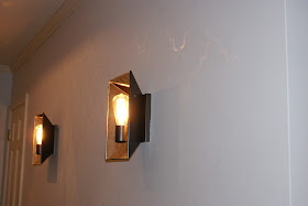
Next decision - what color of paint to use for the stencil.  I did want the wall to be the focal point of our entry, but I didn't want it to get too busy.  The wall currently has two mirrored wall sconces.  It will have a console table (which I have plans to paint a fun color), storage baskets, and some sort of art piece.  Since it will be pretty "filled" visually with furniture and accessories, I made the decision to try a stencil in the high gloss version of the wall color.  Here is the before picture.  


Sorry about that shadow at the bottom.  Not sure if that's my finger or what.  I am not a professional photographer.  Maybe I'll get better as I continue blogging.  Let's hope so for your sake.  


I started by measuring the wall to find the midpoint between the two sconces (aren't they pretty?) so that I could center the design there.  Then I carefully taped my stencil up on the wall.  I bought some spray adhesive that you are supposed to be able to spray on the back of the stencil and then reposition as needed, but I was afraid that it would leave a sticky residue.  I ended up using some blue painters tape instead, which I did have to change out every so often as it lost its stickiness, but other than that, it worked just fine.  Here is an embarrassing backside action shot for you.


I used a foam roller to roll the paint in the gloss finish over the eggshell finish on the wall.


Above, I am trying to line up the stencil perfectly which was kind of difficult since I used such a low contrast scheme.  I later found out that the stencil has little triangular cutouts that you are supposed to use for lining it up and repositioning, but I'm not sure it would have helped me that much.  You have to be very careful about keeping it level and lined up though.  Trust me - if you ever come and visit, we can play a game of Spot My Stenciling Mistake.  It's kind of like Where's Waldo.  And in case you were wondering, my hair looks a bit odd and poofed up in this photo because I'm wearing a headband.  

After a long, grueling process we ended up with this.


It's pretty much what I had envisioned.  It's subtle, but definitely there (even more so in person than in these pics).  A part of me wishes that I had chosen a different paint color for the stencil to give it a little more contrast so that all my hard work was a bit more noticeable, but I think that's because the wall is currently empty.  Once I get around to painting our console table and adding art and accessories, I bet I'll be fine with it being so subtle.  It's been nice to watch how the sunlight coming into the house at different times of the day affects how visible it is.  I highly encourage anybody out there considering a stencil in their house to dive right in!