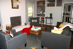
- it is long and narrow
- it is asymmetrical - there used to be a window on either side of the fireplace but when the carport and storage area were built, one was closed up
- there are built-ins on one wall and storage cabinets on another (so furniture cannot be placed in front of these)
- there is a large fireplace (don't get me wrong - I love fireplaces; it's just that they limit the way furniture can be arranged)
My goals for the living room furniture layout were to:
- make sure that the fireplace was the focal point of the room
- avoid mounting the television above the fireplace (I absolutely hate televisions mounted above fireplaces for multiple reasons --> I don't want a TV to be the focal point of my fireplace/mantel area, there is no way to mount the television at eye level and this just leads to awful neck strain, I do not want to permanently drill through the brick in multiple places in a home that is not our forever home)
- create a cozy seating area that does not cut off the flow of the room
We have had the living room furniture arranged at least four or five different ways since we moved in nine months ago. Here is a quick rundown of our trials and errors.
Layout #1
- sofa on the long wall across from the fireplace
- television on the wall with the built-in cabinets (cable hook up is on this wall)
- chairs flanking the fireplace
Why it didn't work:
- the sofa was so far away from the chairs that the seating area felt disjointed instead of cozy
- we got tired of turning our heads to the left to watch television
- there was a strange empty corner to the right of the built-in cabinets (visible in the first photo) which felt like unusable space
Layout #2
Why it didn't work:
- pulling the sofa off the wall created a seating area that was too cozy and one that was difficult to enter
- it also created a narrow walkway through the living room (I felt like we should install a moving sidewalk a la an airport concourse behind the sofa)
Layout #3
- this layout involved placing the sofa perpendicular to the fireplace wall
- the television was on the wall with the weird built-in cabinets like in layout #1
I don't really have any pictures of this layouts, but you can kind of see in the photo below that we had the room laid out this way back when we painted the fireplace.
Why it didn't work:
- the room is just too narrow and this layout again created a small walkway and chopped up the room in a strange way
- the fireplace was less of a focal point now that the sofa wasn't facing it
Layout #4
- the same as layout #3 but flipped around so that the sofa was on the other side of the fireplace and the television was over on the built-in wall (again, no pics, but see below for a depiction)
Why it didn't work:
- pretty much for the same reasons as layout #3
Layout #5 (aka 5th Time's the Charm?, aka How the Living Room Looks Currently)
- we moved the sofa back onto the long wall, but pulled it slightly away from the wall (enough to fit a thin console table behind it)
- we moved the television to the windowless side of the fireplace (so as to avoid any neck strain while watching it)
- we angled one chair on the side of the fireplace with the window
- we placed the second chair perpendicular to the sofa and coffee table (but far enough back from the coffee table so as not to block the view of the television)
- we added two bright poufs in front of the fireplace to take up some unused space and add extra seating
You may have noticed quite a few new things in the living room (or you haven't been paying that close of attention to our furniture, which is fine, too). A post about the new pieces that we've purchased recently for the living room is coming.
In the meantime - yay for progress and finding "the" layout for our living room. I hope.


No comments:
Post a Comment
Thoughts, ideas, suggestions...