Thursday, September 6, 2012

Kitchen Brainstorming - HELP!

I'm having a really difficult time making a decision about paint colors for the kitchen.  Seth and I certainly can't afford our dream kitchen right now as this would include new cabinets, new countertops, a new floor, all new stainless appliances, you get the picture.  And besides all of that, the major issue is the current kitchen layout.  I'm pretty sure it would need some tweaking for functional reasons and to accommodate larger appliances (and changing a kitchen layout costs some serious dough).  Apparently everything is larger now.  Our fridge is tiny compared to newer models and I'm pretty sure they don't even make wall ovens as narrow as the one we currently have (I can only put a cookie sheet in it one way).


Also, we may try to move the laundry out of the kitchen one day which would definitely require a new layout.


I just had to include this picture of the washer and dryer that came with the house.  Isn't that dryer amazing?  It was the most inefficient energy sucker, but it did its job.  I kinda felt like it should be in a museum somewhere (yes, yes...I am spoiled and used to newer dryers).


We used it a few times after moving in before we purchased our new washer/dryer set.  I had been using an LG front loader washer and matching dryer for the past 3 years (a generous present from my parents when I graduated from vet school) but the buyers of our house asked for the washer/dryer to convey when they made their offer.  So, we settled on a "price" for them (by increasing our counter offer) and they were willing to pay it to keep them in the house.  So, we sadly left Henry and Henrietta behind.  (Yes - I had named my washer and dryer.  I'm weird like that.)  We now have the Maytag Bravos XL set which I absolutely love and recommend (I hope it doesn't break down after I post this).  Lowe's was having a 10% off appliance sale and I had a 20% off coupon that we could apply on top of that - woohoo!  I've found that I much prefer the top loader design.  My back is in much better shape now and there is no fighting the mildew that builds up around that rubber piece in the front loaders.  Anyway, back to the kitchen brainstorming.

Bottom line is that knocking down walls and cabinets and reconfiguring our kitchen ($$$) is going to have to wait.  For the short term (to hopefully last us about 5 years), we want to:

  • paint the cabinets
  • update the cabinet hardware
  • paint the walls
  • purchase some super cheap peel and stick vinyl flooring
  • say goodbye to the fluorescent light over the sink and install a pendant

As much as I would love to get rid of our laminate counters, it just isn't worth the expense for our short term update (even Ikea butcher block would cost us over $400 - trust me, I measured and would it really be worth it to buy nicer laminate?).  Ditto for our current almond colored fridge.  The fridge has some issues: it's small, it has a mild odor, the ice it makes doesn't taste quite right, there is scotch tape on one door handle (we aren't quite sure why but I'm hesitant to remove it), and the fruit and veggie bins do not slide in and out without a fight.  BUT, purchasing a new one would involve removing cabinets and enlarging the opening for the fridge.


The recessed area for the fridge actually backs into the living room a bit (see the orange rectangle in pic below) so if we purchased a larger fridge we would somehow have to reconfigure the built-ins in the living room.  That is a bit out of our comfort zone for right now.  So, we will live with the fridge until we get some expert advice and help or until it dies and we're forced to purchase a new one.


Thankfully, the dishwasher is a standard size (yay!!!).  I constantly have my eye out for a cheap stainless version and make a point to walk through the appliance clearance section at Lowe's when I'm there.  But we are in no rush to purchase a new one since ours works well (despite part of the lower rack being rusted out - haha).  So, I will hold out for a great deal as long as I can.  

Enough about our kitchen and what doesn't work for us.  On to more exciting things like choosing a paint color for the cabinets.  There are a couple of factors to consider.  The new cabinet color needs to look good next to our almond colored dishwasher and fridge, our black wall oven, and also next to our new white washer and dryer (named Wanda and Walter in case you were wondering).  It should be something we can live with for the next 5 years.  Really, that is about it.  

Now, I L.O.V.E white kitchens like these.


I have dreamt of white kitchen cabinets for years.  The light, airy feel is so refreshing and clean-looking (and shouldn't a kitchen be clean?).  Naturally, I wanted to paint the cabinets white...until I reminded myself that a stainless fridge and dishwasher might not be happening for awhile.  And I do NOT think that white cabinets and almond appliances look good next to each other.  So, white was out.  :(  On to the other colors of the rainbow.  
  • Red?  I'm just not a huge fan of it.  It's slowly growing on me as I age, but I'm not sure I could handle it on all of the cabinets.  
  • Orange?  Maybe.  But not UT orange.  Still possibly a bit bold.
  • Yellow?  Nah.
  • Green?  The sesame color from the office?  Maybe.
  • Blue?  Maybe.  Would navy be too dark?  Maybe one shade lighter or one shade darker than the dining room?
  • Purple?  Um, probably not.
  • Gray?  Same as white - I don't think it would look good with the almond appliances.

Here is some eye candy for inspiration.  (All images are from houzz.com.)


I am also toying with the idea of doing two cabinet colors: the upper cabinets in white and the base cabinets in one of the other fun colors above.  I'm having trouble figuring out how to "divide them up" between the two colors though because of the wall oven (I don't know how you would pick a place to "stop" each color since the wall oven is surrounded by trim that connects the upper and lower cabinets), the cabinets around the fridge (because they should probably be all one color), and the cabinets above the washer/dryer (because they are on the same wall as the fridge).  I think I would paint the base cabinets, the cabinets surrounding the wall oven, and the cabinets surrounding the fridge the fun color and paint the upper cabinets white.  I am just not sure what to do with the cabinets above the washer/dryer.  Since they are on the same wall as the fridge should they all be the same color?  But they are also uppers so maybe they should be white?  I have no idea.  This is one reason I'm not sure two cabinet colors would work in our kitchen.  Here are some pics to give you an idea of the layout and how I might divvy them up.

The cabinets with the green box around them would be the only white ones in the kitchen.

The fridge is on the wall opposite the sink (seen in the previous photo).   

The washer and dryer are on the same wall as the fridge separated only by the door to the living room.

Now I need your feedback.  I want to hear your cabinet color suggestions and your opinions about painting the cabinets all one color or two different colors.  And if two different colors, how would you decide which ones to paint which color?  Here are the rest of the colors in the house so far to remind you and help with the brainstorming.


After the cabinet color decision will come the wall color decision.  I think I might be reaching my paint color decision limit.  The whole house might end up gray or tan if you don't help me out.  :)  

Painting the Fireplace

After living with the cream fireplace for over a month, Seth and I were more than excited to paint it.  You might remember how dingy it looked the day we moved in.


It's somewhat difficult to tell just how cream/tan it is in pics since the trim and walls are the exact same color.  Isn't that a huge design mistake - trying to make your fireplace blend in with the walls?  I'm pretty sure it is supposed to stand out and be the focal point of the room.  I am certainly excited to have a fireplace again after a few years without one and definitely want it to be the focal point.  Seth is a great fire-maker (is that a word?) and I am great at lounging in front of it.  ;)

White was the obvious color choice, but I had also been chewing on the idea of a dark gray fireplace like this, this, or this with white walls.  In the end, Seth and I decided to stick with white for the fireplace.  Although I gravitate to pictures of rooms with white walls on Pinterest and Houzz, I am just not sure I am ready for them in our living room.  Other people make them look homey, but I fear that ours would just look stark.  I'm sure it's all in choosing the white paint (make sure it has warm undertones) but I am not up for it just yet.  I think you're supposed to be an artist or art collector also to ensure you have plenty of thought-provoking, colorful art to hang on those white walls.  Maybe in our next home.  

So, we stopped by Lowe's and picked up a roller with extra long nap to get into all the crevices in the bricks.  (We already had some white paint.)  We went with 6" long rollers with 3/4" nap.  The rollers that you normally use to paint smooth walls usually have a 3/8" nap.


We started by wiping down the entire facade with warm water with a tiny bit of dish soap in it.  It didn't look dirty but the water in the bucket when we were finished certainly proved otherwise.  Then we started painting.  No need to prime it since we weren't painting over the original brick but merely painting on top of brick that had previously been painted.  Yay for eliminating a step!  We got pretty good coverage with the rollers but did have to use brushes to get in between the bricks and to get into deep crevices on the bricks themselves.  We applied two coats of Olympic No-VOC off the shelf white paint in semi-gloss while Amos supervised (he looks like he was fighting off sleep or maybe he was just bored with our painting).


Then we stepped back to admire our work.


Ahhh...much better!  Maybe one day we will clean the inside of it.  I fear that will involve a wire brush and repainting with heat resistant paint.  Yuck!  I'm all about the easy, instant gratification projects right now.  :)  When our house starts looking a bit more like a home, I will work up the energy to tackle those kinds of labor intensive things.  Now, to choose a wall color.  Any suggestions?  Should the whole room be the same color?  Or maybe the fireplace wall should be a bold color and the rest of the walls neutral?

Tuesday, September 4, 2012

Dining Room Do-over

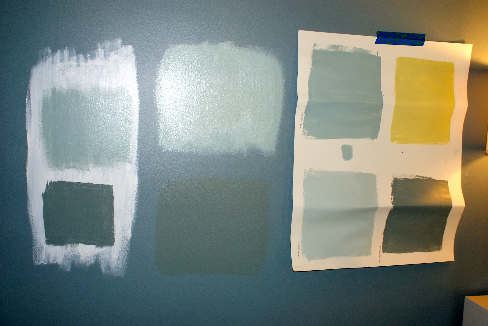
We I finally settled on a paint color for the dining room.  After what felt like a lifetime of picking paint cards, painting sample squares, and comparing them to the rug colors I made a decision.  I feel like I deserve a round of applause at my next Indecisives Anonymous meeting followed by an awkward group hug.  Here are some of the photos I took while deciding.


I won't even tell you how many sample pots of blue paint we now own.


Believe it or not, the first three samples across the top in the photo above are all the same.  It was blowing my mind how different this color looked (A) on top of primer, (B) directly over the current color, and (C) on poster board.  Why is it that (B) is the lightest appearing when the others are on top of white?  This made no sense to me.  At times, I felt like I was going to pull all of my hair out.


These other samples are also the same color.


There were days that I felt like I was going crazy.  But I kept coming back to the lighter blue on top of the primer.


It went against my original dream of a dark blue dining room (I mean how amazing is this room?)...


but, I decided it was the best decision.  It would go nicely with the rug, lighten up the room a bit, and it seemed like a nice classic color to me.  So, it was settled.  Benjamin Moore's Wedgewood Gray it was.

So, we used some leftover primer from when Seth primed the hallway and painted yet another coat of paint on our dining room walls.  Then, my sweet mother helped me paint two coats of the Wedgewood Gray (color matched to Valspar) while she and my father were visiting this past weekend.


Yay!  Again, the trim will be painted white at a later date.  :)
Ahhhhhh....I feel such a relief now that we found the right color for the dining room.  
Next up - the kitchen and living room.  

Thursday, August 30, 2012

Choosing Paint Colors part II

And the painting continues.  Will it ever end?  Trying to look on the bright side, I just calculated the number of calories that I'm burning at everydayhealth.com.  If I paint for three hours (which is about how long it takes me to do two coats in a medium sized room by myself) I am burning around 725 calories.  Not too bad I guess.  Maybe I can have another one of those Knock You Naked Brownies I made from Pinterest tonight after all.

We have managed to nail down three more colors and get some paint up on the walls in the hallway, the first guest bedroom, and our office.  The hallway and first guest bedroom were probably the easiest paint color decisions yet.  We liked the look of our light gray hallway in our last home because it brightened up the entryway and was a nice neutral backdrop that allowed us to incorporate colors from other rooms with art and accessories.  I think it's nice when your entryway kind of ties the whole home together (at least the main living areas).  


So, we were deciding between Valspar's lunar eclipse (1) and Valspar's polar star (2).  

1

2

They look pretty similar but the lunar eclipse is slightly more brown so we settled on the polar star (4005-1A).  While I was visiting my parents and attending a bridal shower for my brother's fiancĂ© (yay!!!) this past weekend, Seth primed and painted the entire hallway.  What a great husband!  The color is pretty much what we expected but I think the cream molding with its yellow undertones is throwing the whole thing off.  Ahhhh...the molding.  The entire house is full of this yellowy cream molding color.  What ever happened to a nice, crisp, refreshing, modern white???  It's on the to do list.  We may end up hiring that awful job out.  Any takers?  :)

Here is the hallway after Seth's hard work.


You may remember that I nailed down the color scheme for our first guest bedroom when I scored an amazing deal on some nightstands here.  With the master bedroom and hallway colors chosen, I focused on a goal of mine for our new place - reducing the total number of paint colors in the house.  In our first house, we had seven different colors in basically nine rooms (four of those were shades of blue).  I never thought it looked bad, but I definitely wanted to make our color palette for the second house a bit more cohesive to allow for better flow from room to room.  I have to keep reminding myself that I can always use accessories to add different accent colors in each room to prevent them from all looking the same.  One thing I wanted to do was choose paint colors from the same paint card, just in different shades, in order to provide continuity while avoiding a boring, monochromatic palette.  So with this goal in mind, and the fact that we decided on gray walls in the first guest bedroom to complement our yellow nightstands, we just moved one shade darker on the polar star paint card and found our guest bedroom color: Valspar's gravity (4005-1B).


I tackled that project yesterday (my parents are coming for Labor Day weekend and I wanted it painted and mostly put together for their visit).  So 725 calories later, here she is.  It's reading a bit blue in the picture, but in person it's definitely more gray.


The other room that we've painted is the office (the former dining room).  The color we settled on is Benjamin Moore's Sesame 381 (color matched to Valspar paint).  


It actually turned out a bit lighter and more yellow-looking than I had hoped but it should still work.  I blame the dark green color that we painted over (although we did have the paint and primer in one).  Amos even got in on the action.  


Here is the color on the wall (next to a section of trim that we slapped a bit of white paint on just to get the effect).  


Ahhhh...the green on yellow-green combo.  Lovely.  Has anyone decided to donate their time and help paint our trim yet?  

We choose this color for the following reasons:
  • we liked it
  • it goes nicely with blues and grays (our other main wall colors in the house)
  • it works well with our current furniture for the room (white and dark brown)
  • it complements the rug we have chosen for the office (it was our living room rug in our last house - more on that in another post)
I love how bright and fun it is.  It is amazing how much larger the space feels now.  We are also considering it for the living room, but haven't decided yet.  In the meantime, I'm wondering if you can get carpel tunnel from excessive paint rolling?  (Or maybe it's the blogging.)

Thursday, August 23, 2012

Putting My Jewelry on Display

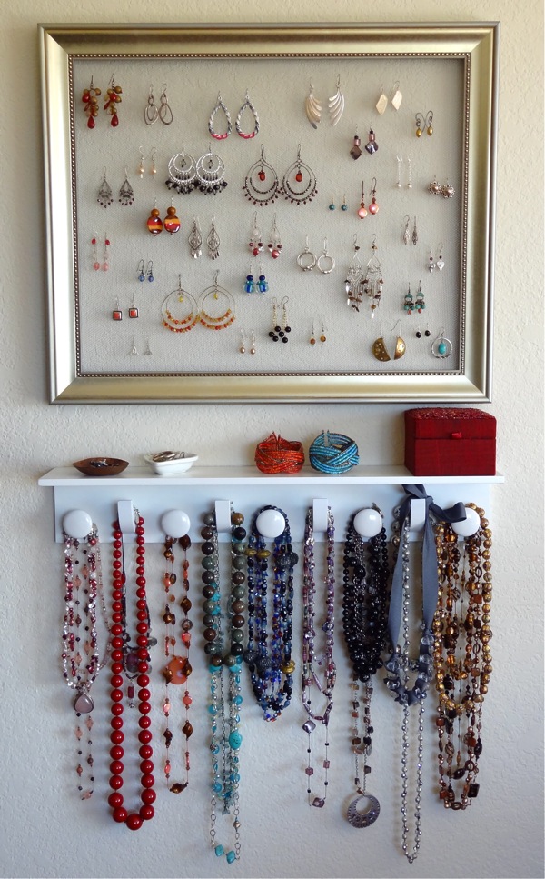
I have been eyeing jewelry display ideas on Pinterest (where else?) for awhile.  I think they're a great way to fill up wall space while clearing off and decluttering your dresser top.  I currently have a sizeable jewelry box on my dresser that is filling up fast.  I am not a fan of those huge jewelry armoires that stand on the floor and always look like they came from the Victorian era.  And...they are pricey! So, I decided that displaying most of my jewelry on the wall above my dresser might be a great solution.  Here are some of my inspiration pictures:


this is supposedly from better homes and gardens but i can't find it on their website


I really liked the third picture and how she used antique-looking knobs to hang her necklaces and bracelets on.  However, I didn't want to copy her earring display since I needed A LOT more earring display space.  I liked the photos with the mesh screen used for earring display.  Off I went to Hobby Lobby and Lowe's for supplies.  (I think Lowe's is going to put a cot out in one of their aisles for me soon.)

I came home with the following supplies:
  • assorted plain and printed scrapbook paper (from Hobby Lobby at 40% off)
  • 4 frames (from from Hobby Lobby at 50% off)
  • assorted decorative knobs (from Hobby Lobby at 50% off)
  • aluminum mesh screen (from Lowe's at 5% off with my trusty, worn-out Lowe's card)
  • bolt cutters (also 5% off since I paid with my Lowe's card)

I started by laying out the frames I had purchased (along with one I already had) so I could figure out where I wanted earrings (mesh screen) and where I wanted necklaces and bracelets (cardboard and scrapbook paper).  Then I measured and cut the screen for the earring frames.


I thought I was going to be able to use my staple gun to secure the screen, but the staples were too long and would have come through the other side (the larger earring frame had only 1/8" depth to work with).  Then I thought about regular staples, but my stapler has a curved "nose" and I couldn't get it into position.  I debated another trip out of the house to search for some sort of tack that I could hammer in to secure it, but then I decided to try the hot glue gun.  It is holding so far, but I am a bit concerned about long-term strength.  I may still search for some tacks and really secure the mesh at a later date.  

While I had the frames laid out, I also took the time to plan which pieces of scrapbook paper would go in which frames and which knobs I would use.  


I then cut cardboard (we still have quite a few boxes) and the paper to fit.  I used spray adhesive to attach the decorative paper to the cardboard.  I then used a hammer and nail to create holes through the paper and cardboard where I wanted the knobs to go.  The holes were slightly smaller than the knob shanks (I think that's the proper term) because I wanted to make sure they would be secure.  I used the bolt cutters to cut off the excess shank.  On a couple of the thicker ones I had to break out the hack saw and partially saw through it before I could use the bolt cutters to finish it off.  Then I screwed the knobs into place.  


The cut ends on the back of the knobs were quite sharp and I definitely didn't want them scratching the wall so I used some small felt pads to cover them.  


I considered using paper to lay out my frames, trace their outlines, then tape the paper on the wall and hammer away like this, but I decided that was too much work for five frames.  I would definitely recommend it for a larger group though.  

So, I just used a measuring tape and winged it.  Here she is ready and waiting for some bling.  (I'll show you more complete shots when I post the master bedroom reveal.)


And all decked out...


In hindsight, I probably should have taken the time to measure my necklaces and designed a more custom display.  In my defense, however, I had planned to hang the largest frame (in the center) vertically for long necklaces, but somehow when I was piecing together the scrapbook paper for that frame I completely forgot that plan.  It took four pieces of scrapbook paper to fill the frame and getting the design lined up properly was a bit of a pain.  So, when I realized that I had oriented the design on the scrapbook paper in a way that would kinda force me to hang it horizontally, I was super disappointed, but also unwilling to make a trip to Hobby Lobby for more paper and unwilling to start all over again.  Oh, well.  It's rare that any project I complete actually turns out how I had first imagined.  That said, I am quite pleased with the results.  Our master bedroom is really starting to come together!