The last time I showed you our house's paint colors was back in January of 2013. Wow - I can't believe it has been two years. Back then, it looked like this:
Since then, we have painted over the navy blue accent wall in our master bedroom, added gray stripes to our master bathroom, painted the kitchen walls and ceiling, and most recently repainted the office and dining room after switching their duties.
Today, our house is looking more like this:
I'm finding that I really like soft, neutrals on the walls and adding pops of color in through artwork and accessories. After two years, we now have a better idea of how to tweak this house to make it work best for us. I'm happy with where this house is headed.
I know I kept you in suspense after my last post. I went back and forth on what color to repaint the dining room. The sesame was just too bright and "in your face" for relaxed digestion.
It was cheery in our old office, but it was time for a change. I considered Benjamin Moore's Woodlawn Blue (what we have in our living room), Benjamin Moore's Hale Navy on an accent wall or a half painted wall like this, or Valspar's Polar Star (what's in our entryway/hallway).
I decided to go with the Polar Star.
(Sorry about the blown out windows. One day I'll read this tutorial and fix those for you.)
Here is what it looks like from the new office.
I think the Polar Star was the right decision to help achieve the light and airy look that I'm going for.
So the dining room walls were coats #7 and 8 of our eight coats in eight days painting extravaganza.
I'm going to work on an updated whole house color scheme post for you. And I need to introduce you to our office rug and my new desk!
Eight coats of paint in eight days. In only two rooms. I don't ever want to relive it.
When we decided to flip flop the office and dining room to better suit our needs, I knew that I also wanted to change the wall colors in these two rooms (much to Seth's dismay). You may remember that I was leaning towards white walls a few weeks ago. Well, I decided that I also wanted a light blue ceiling.
So, Seth and I took a bunch of our light blue paint samples and dumped them into a paint can with some leftover white paint. I felt so resourceful. We made the icy, light, grayish blue that you see in the roller tray above.
But then we started rolling it onto the ceiling and it looked completely different.
What the heck? Painting this room baffles me. Then we thought, 'Maybe the blue walls are reflecting off the ceiling and causing it to appear more saturated than it really is.' So we used a piece of white poster board to cover part of the wall. But it was really hard to tell if it made a difference. So, we decided to stop painting the ceiling and tackle the walls first.
Now, I really loved the Wedgewood Gray. But the white walls really brighten the room (I think that's two coats in above). It was kinda shocking to me how much brighter it got. We used Valspar's Ultra White (formerly Anthem White) which is the same color as our bedroom.
It took one coat of high hiding primer and THREE coats of Ultra White. I had hoped that the "high hiding primer" would help us cut down on the number of coats needed but I guess not. Lesson learned: white paint does not cover well. That's probably obvious to most of you, but it wasn't to me.
Now back to the ceiling. Amazingly, I picked up some paint swatches from Lowe's and immediately loved Valspar's Stillness.
It ties into the artwork in the entryway and the print that I ordered for above my desk. And it is such a soft, soothing color.
The ceiling took the normal two coats. For those keeping track, we're up to six coats. The other two were for the dining room walls. I'm going to leave you hanging and reveal the new color in my next post.
The end of February will mark six months since we moved to Jackson. Crazy. We have definitely gotten a lot done around here but we still have TONS on our to do list. Good design evolves over time, right? That's what I've been telling my impatient self anyway. I do find that if I rush into a purchase or a project, I usually end up changing my mind, disliking it, and redoing it later. I'm trying to slow down, gather inspiration from the world wide web (does anyone call it that anymore? no? well, i'm bringin' it back), and purchase furniture as we can afford it. So far, so good. Since we're hitting the six month milestone soon, I thought it might be nice to show you guys the progress we've made throughout the house. Without further ado, here are some pics and a behind the scenes look at our to do list. Warning - despite being divided, this is still a very long post. If needed, walk away, drink some coffee, and come back later. I know I did when I wrote it.
Exterior (front)
We haven't done a whole lot out front yet. In August we were focused on getting settled into the house, clearing paths through the boxes, figuring out which box the extra TP was in...ya know. Now it's winter (albeit not that cold) and therefore not the time for outdoor painting or planting. Obviously, the before shot is much greener since it was summer.
replaced the plugs, switches, and their covers (they were all cream and Seth is working on replacing them throughout the entire house - he is awesome!)
added an area rug (we chose Flor tiles in order to make sure our "rug" was the exact size we wanted)
hung some white cubbies
Still on the list:
paint the console table (I bought the paint over a month ago, I just haven't tackled the project yet)
style the console table
style the white cubbies
paint the trim and closet door white
paint the inside of the front door (white?)
purchase a small doormat for just inside the front door
DIY some art for the spot across from the coat closet (I have some ideas)
Dining Room
(previously the formal living room)
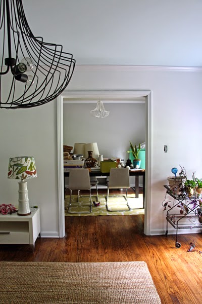
The dining room has turned into a dumping ground of sorts for our boxes of wall decor. Yikes! After painting and repainting this room, I am without a doubt absolutely in love with the Wedgewood Gray (Benjamin Moore). I estimate that we are 50% done in here.
added an overhead light fixture (We hired an electrician to come out since this room previously had no overhead fixture. Seth is super comfortable changing out lights where there are already wires but neither of us has experience running wires down from the attic and cutting holes in ceilings.)
replaced all of the plugs, switches, and their covers
created a "cat feeding station" with pet storage using two Ikea malm chests (The cats have to eat elevated so Amos cannot reach their bowls or we would have one FAT chihuahua on our hands and I absolutely refuse to have a fat chihuahua - I have seen too many at work. The good news is that their bowls really don't have to be that high to be out of Amos' reach.)
dressed our windows with bamboo blinds and curtains (I'm waiting until the trim is white to decide if I like the tan color of the curtains or not. I originally purchased them for the master bedroom but I didn't like them in there so they ended up in the dining room. Time will tell if they stay here.)
dressed our window with bamboo blinds and a pair of nice white curtains
Still on our list:
paint the trim white
finish filling the upper shelf above my desk
hang a small piece of art to the left of the window?
unpack the boxes under Seth's desk
purchase a nice brown leather desk chair for Seth (his current one is my old one from college and it's black; in case you couldn't tell his desk and the Ikea storage unit are both dark brown)
paint the filing cabinet (it is distressed and cream right now - neither are really my thing)
stock/organize/style the bookcase
figure out a solution for the plug (check out the first pic - there is not a plug on the back wall where our desks are and it is an exterior wall which means mo' money than we're willing to spend right now for an electrician to run wires and install one - boo)
Kitchen
Pop quiz, hot shot - how many sample squares of paint did you spy on my cabinets? (Who knows what movie that's from before clicking on the link?) I went a little crazy in there but I believe I have finally made a decision (well, technically I've only decided on the color family, not the specific shade). You'll just have to wait until spring when it warms up and we decide to tackle painting the cabinets to find out what that color is. We are still in love with our chalkboard wall and use it all the time to jot down notes to one another, write reminders to include certain items on our weekly grocery list when we notice we're running low, and to greet our house guests with welcoming messages.
We are probably only 30% done in here. Remember, as much as we would love to gut the kitchen and reconfigure everything, we can't afford a full kitchen reno right now (which would likely be $20K+). We are going to try to spruce things up for around $3000 including the price of our new dishwasher and our hopefully soon-to-be-found new fridge (not including the new washer and dryer since they aren't normally involved in a kitchen remodel). Even if we were expert DIYers I think it would take $8-10K for our kitchen reno so I'm willing to put in a bit of money now to be happy for the next 4-5 years until we can save up enough for a full reno.
So far, we have:
painted the walls (Valspar's Clean White WV31001; a Waverly color)
We spend most of our waking hours in our living room (when we're not at work) so I definitely want it to feel fun and represent our personalities well. Similar to the dining room, I had a difficult time choosing a paint color for this room (you can read about that here). I do like the color that I chose (Benjamin Moore's Woodlawn Blue) but some days I wish it were a bit more saturated. It's fine for now and I think once the room is more complete I'll like it more. This room is probably 40% complete.
removed the top piece of wood on the far left built-in so that they are all the same height (the cream piece visible in the before photo above)
sanded and primed the built-ins (but it needs to be redone because while I was sleeping Seth used the wrong primer and it scratches right off - sad day)
replaced the outdated fan (visible in one of the pics above) with our dining room chandelier that we spray painted (I'm thinking it may end up in a guest bedroom one of these days)
purchase new seating (definitely a couple of chairs and maybe a chaise)
purchase end tables (I've been searching with no luck thus far)
purchase a new coffee table (again - can't find what we want, in the height we need, in our budget yet)
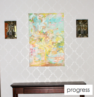
wall decor for above the sofa (I've already purchased something but it needs some attention first)
plan for the empty corner next to the television including the wall to the left of the fireplace (we have some ideas)
re-prime built-ins and paint
fill and style built-ins
paint or replace knobs on built-ins
dress windows with curtains +/- blinds
install fireplace mantel
style fireplace mantel
Whew. We have definitely accomplished a lot, but still have so much left to do. I am proud of the fact that I am taking things one day at a time with this house. With our first house, I rushed to get everything just the way I thought I wanted it (I'm sure I will always be tweaking something) and didn't really stop to enjoy the process. I'm trying to remedy that this time around and it seems to be working. Stay tuned for part two of this update.
What do you guys think of our progress? Do you get impatient with home improvement/decorating projects or do you let them slowly evolve and savor every moment?
Since we probably won't be painting the kitchen or the back guest bedroom for awhile (since we are slowly working up the energy for the former and the latter is currently our storage area and full of furniture and boxes), I thought I'd share the color we landed on for the living room. The phrase "landed on" kinda makes it sound like one of us closed our eyes in a room full of paint cards, waved our finger around, the other yelled stop, and we went with the color being pointed at. I can assure you it was NOT that easy. And choosing paint colors that way sounds reckless and insane to a type A, perfectionist person like me. Instead, I like to over-analyze and labor over my choices. Sounds much more fun, right? It's something that is ingrained into my personality. I think that is why I tend to question my original paint color decisions and repaint rooms. Speaking of repainting rooms...
For the living room, we needed a color that
would be dark enough to "highlight" the freshly painted white fireplace
would be light enough that the room would not end up too dark
would coordinate with the rest of the colors in the house that we've chosen so far (see here and here for those)
The first color that I thought was going to be perfect for living room was Benjamin Moore's Meadow View 383. It seemed to be a nice medium shade that would make the fireplace stand out without darkening the room too much. It is two shades darker than the office color (Sesame) so it would definitely fit right into our color scheme. We had already painted squares of Benjamin Moore's Van Courtland Blue HC-145 - too dark for the whole room, Benjamin Moore's Sesame 381 - too light to make the fireplace stand out, Valspar's Clove Bud - just not feeling it - not enough brown in it, and Valspar's Metropolis - which is one shade darker than our guest bedroom and two shades darker than our hallway- looked waaaaay too purple and here I thought it was gray. I painted a square of the Meadow View and decided it was perfect. So we purchased a couple of gallons and got started.
Looks fun, spring-y, and innocent enough right? I wish I had taken a picture of it after we painted one coat. It was too dark for the room and resembled pea soup. It was just not the right color. Here it is in someone else's room so you can get a better idea. I actually like it in this pic, but it was just not doing it for me in our living room. Trust me.
I still like the color itself. It's a fun kind of color. Here someone has used it to paint a dresser in a nursery (sorry, I couldn't find a better pic of it).
I'm thinking since we have a whole gallon of it left, I need to find another project to use some of it up and this dresser has me thinking. Could be another disaster or could be something great. I'll let you know what project I end up putting my extra paint and creative energy towards, of course.
So...we were back where we started after nixing the pea soup color. I liked the idea of gray a lot. A nice medium to dark gray to highlight the white fireplace. But then, the rest of the room would be too dark. So, we threw around the idea of an accent wall of medium to dark gray around the fireplace and a light gray on the other walls. Something like this is what I had in mind (image from houzz.com).
Nice, right? The problem was choosing a gray. I have difficulty making design decisions. Did you just nod your head, roll your eyes, and say "ya think"? Good. You know me well already. I really wanted to stick with the "family" of grays that we had already chosen (ie colors only from the paint card that we used for the hallway and guest bedroom) but as I already mentioned above, the metropolis was just way to purple-looking. So, we went back to an old tried and true favorite - Valspar's Tempered Gray 4004-1A. It was in the hallway, master bedroom, and master bathroom of our first house.
So we purchased a gallon of Tempered Gray and a gallon of one shade darker, Urban Sunrise. We used the Urban Sunrise to paint the fireplace wall and the Tempered Gray to paint the other walls. And...it was ok (don't mind the paint squares).
I liked the fireplace wall and I liked the wall opposite the fireplace, but something about the other walls and the corner where the two colors met was not good. Ugh. At this point, I thought I might make Seth crazy. I was going crazy. We lived with it for maybe a day or two while I brainstormed about another option and browsed tons of pictures online. (Seth thinks my browsing online pics is the problem. I see a room, love the color, and try to recreate it in our house and it doesn't always work. Then I'm disappointed and frustrated and we are back to square one. He is probably partially correct, but that's how I get inspiration.) During my online browsing, I came across a couple of pics in my living room ideabook on houzz.
I especially love the second one. I NEED to incorporate orange into our living room somehow. I just love it (almost as much as I love blue). I also love the eclectic feel of this room. It's cozy and collected and fun and wonderful. These rooms turned my thoughts to Benjamin Moore's Woodlawn Blue HC-147. It is one shade lighter than our dining room color (Wedgewood Gray). I actually already had a sample of it (because I was considering it for the kitchen walls at one point) so Seth fished it out of the closet and slapped some up on the walls in a few different places for us to study (hence the random paint on the walls in the photos above). Ahhh...much more soothing and happy than the gloomy gray. So we purchased yet another two gallons of paint from Lowe's. Have I mentioned that there are multiple employees at Lowe's that say hello to us each time we go in there? I'm convinced that we are responsible for half of their paint sales over the last quarter (ohhhkay - probably not quite). I'm also convinced that I married the only perfect person in the world for me. Who else would put up with my paint craziness and still love me? And still help me with the painting??? :)
Without further ado, our light blue-gray living room.
I really need to get on that nasty cream/tan molding. Now, she is just waiting for some fun tangerine accents and updated furniture. Seth is still trying to hold onto the ugly, old, brown leather recliner that he inherited from a former roomie. On one arm, the leather is torn open and the foam is exposed. It's kind of an eyesore. Why is it that guys think they need a large, ugly, leather recliner in their life? I promise there are other pieces of furniture that look nicer and are just as comfortable. Reminds me of Joey and Chandler's beloved recliners on Friends.
Hopefully, we can start the more fun stuff soon - like nailing down furniture arrangements, hanging drapes and art, buying area rugs, etc. I will keep you updated on the progress!


