We have managed to nail down three more colors and get some paint up on the walls in the hallway, the first guest bedroom, and our office. The hallway and first guest bedroom were probably the easiest paint color decisions yet. We liked the look of our light gray hallway in our last home because it brightened up the entryway and was a nice neutral backdrop that allowed us to incorporate colors from other rooms with art and accessories. I think it's nice when your entryway kind of ties the whole home together (at least the main living areas).
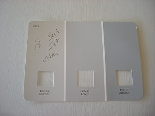
So, we were deciding between Valspar's lunar eclipse (1) and Valspar's polar star (2).
They look pretty similar but the lunar eclipse is slightly more brown so we settled on the polar star (4005-1A). While I was visiting my parents and attending a bridal shower for my brother's fiancé (yay!!!) this past weekend, Seth primed and painted the entire hallway. What a great husband! The color is pretty much what we expected but I think the cream molding with its yellow undertones is throwing the whole thing off. Ahhhh...the molding. The entire house is full of this yellowy cream molding color. What ever happened to a nice, crisp, refreshing, modern white??? It's on the to do list. We may end up hiring that awful job out. Any takers? :)
Here is the hallway after Seth's hard work.
I tackled that project yesterday (my parents are coming for Labor Day weekend and I wanted it painted and mostly put together for their visit). So 725 calories later, here she is. It's reading a bit blue in the picture, but in person it's definitely more gray.
The other room that we've painted is the office (the former dining room). The color we settled on is Benjamin Moore's Sesame 381 (color matched to Valspar paint).
It actually turned out a bit lighter and more yellow-looking than I had hoped but it should still work. I blame the dark green color that we painted over (although we did have the paint and primer in one). Amos even got in on the action.
Here is the color on the wall (next to a section of trim that we slapped a bit of white paint on just to get the effect).
Ahhhh...the green on yellow-green combo. Lovely. Has anyone decided to donate their time and help paint our trim yet?
We choose this color for the following reasons:
- we liked it
- it goes nicely with blues and grays (our other main wall colors in the house)
- it works well with our current furniture for the room (white and dark brown)
- it complements the rug we have chosen for the office (it was our living room rug in our last house - more on that in another post)
I love how bright and fun it is. It is amazing how much larger the space feels now. We are also considering it for the living room, but haven't decided yet. In the meantime, I'm wondering if you can get carpel tunnel from excessive paint rolling? (Or maybe it's the blogging.)


I have been going back and forth between polar star and pelican 4007-1A. In bright light the pelican looks bluish.
ReplyDeleteI agree with you on that I wanted a grey look. So I am choosing the polar star. As my single wall darker shade I am torn between the gravity and metropolis.
I bought all 3 in samples... Going to live with swipes for a week or two.
Thanks for the great photos and the calorie count!! I have 3 rooms to paint ;-)
Glad you found this post helpful, Annellis35. I'm interested to see what you think of the Polar Star on your walls. In our house it does have a bit of a blue or maybe even purple undertone. Good luck with all your painting!
ReplyDeleteI have FINALLY begun painting. My closet is finished with 1 coat "high coverage primer" and the polar star (2 coats). The rest of my bedroom is primed and ready to go.
ReplyDeleteI LOVE it. Each time I walk into my closet I think about how great it looks and the calories I burned :) . I never realised grey has so many possible undertones. My theme really has a blue undertone I believe... which is fine because I saw when selecting drapery fabric that the brown undertone of grey is not my style at all.
With my limited schedule we plan to complete our project mid june.
So glad you're loving the Polar Star, Annette. :)
DeleteThanks for the info... Do you think the final color depends on the current wall color? I wanted to use Silver Dust 7004-19, it had bad reviews. Some said it turned out purplish. Looking for true med/light gray. Thanks for sharing.
ReplyDelete