Showing posts with label office. Show all posts

Tuesday, August 26, 2014

Paint, Paint, and More Paint

Eight coats of paint in eight days.  In only two rooms.  I don't ever want to relive it.

When we decided to flip flop the office and dining room to better suit our needs, I knew that I also wanted to change the wall colors in these two rooms (much to Seth's dismay).  You may remember that I was leaning towards white walls a few weeks ago.  Well, I decided that I also wanted a light blue ceiling.  

So, Seth and I took a bunch of our light blue paint samples and dumped them into a paint can with some leftover white paint.  I felt so resourceful.  We made the icy, light, grayish blue that you see in the roller tray above.

But then we started rolling it onto the ceiling and it looked completely different.


What the heck?  Painting this room baffles me.  Then we thought, 'Maybe the blue walls are reflecting off the ceiling and causing it to appear more saturated than it really is.'  So we used a piece of white poster board to cover part of the wall.  But it was really hard to tell if it made a difference.  So, we decided to stop painting the ceiling and tackle the walls first.

Now, I really loved the Wedgewood Gray.  But the white walls really brighten the room (I think that's two coats in above).  It was kinda shocking to me how much brighter it got.  We used Valspar's Ultra White (formerly Anthem White) which is the same color as our bedroom.  
It took one coat of high hiding primer and THREE coats of Ultra White.  I had hoped that the "high hiding primer" would help us cut down on the number of coats needed but I guess not. Lesson learned: white paint does not cover well.  That's probably obvious to most of you, but it wasn't to me.

Now back to the ceiling.  Amazingly, I picked up some paint swatches from Lowe's and immediately loved Valspar's Stillness.  


It ties into the artwork in the entryway and the print that I ordered for above my desk.  And it is such a soft, soothing color.

The ceiling took the normal two coats.  For those keeping track, we're up to six coats.  The other two were for the dining room walls.  I'm going to leave you hanging and reveal the new color in my next post.

The positive news - I'm now a pro at cutting in.

Tuesday, July 23, 2013

Cord Organization

My desk has had a mess of cords underneath it for almost a year now.


I have finally done something about it.  I'm not sure why this simple project took me so long.  There are many options out there for cord/cable management, but I knew that I wanted more than just organization with ties and cable spools.  I wanted concealment.  I was envisioning something like this cable management box from Ikea or this one from Poppin.  I was about to order the one from Ikea (and save a little moo-lah), but the hubby said he liked the look of the one from Poppin better.  So, Poppin it was.


It's simple to use.  Just pop off the top, set your surge protector inside, and guide the cords out the openings on either side.


Not perfect, but much better.  The large white extension cord can't go yet because we don't have an outlet on the wall behind our desks.  Maybe one day we'll pay an electrician to install one, but it will take longer (i.e. cost more) since it's an exterior wall.  :(


How about that before and after?  I love it when simple projects make me smile.

Have you guys tackled any quick, easy projects at home recently?

Friday, December 28, 2012

Office Inspiration Board

When I spotted this inspiration board that Ashley from Seventh House on the Left made, I knew it would be a perfect addition to our office and I had just the place to hang it.  I had been ignoring the large blank wall to the left of my desk until recently when I entertained the idea of some sort of art piece for it.  I really get tired of framed art on every wall though, so I try to switch it up with unframed canvases, mirrors (I have an antiqued mirror project in the works so stay tuned), cardboard animals, spray painted cardboard letters, and even plastic animal halves.  I'm open to most anything that is different and takes up wall space.  I've just never been fond of having framed pictures of myself in every room.  I do appreciate the sentimental value of pictures and the memories that they invoke, however, and so we do have a few in the bedroom.  I just don't want them in every room of the house.  All that to say that I was excited by the possibility of a DIY project that would take up wall space and would be something different and functional.

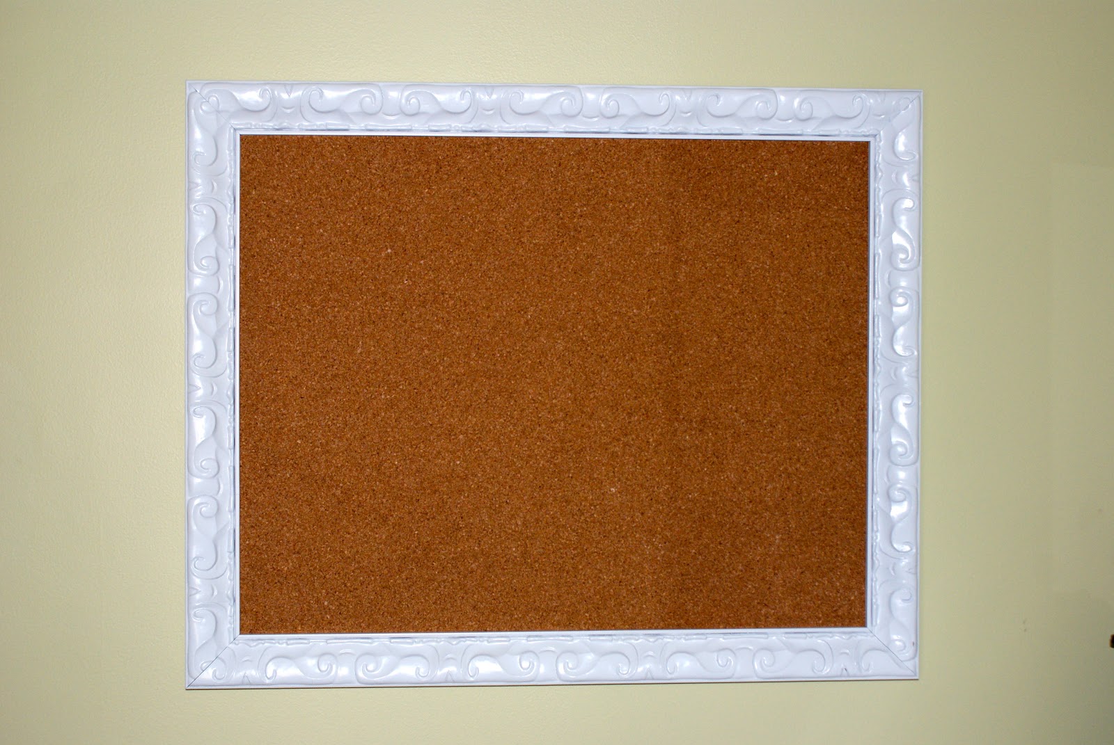
I started with a 50% off open frame from Hobby Lobby.  It used to be silver but I spray painted it a glossy white.


The cardboard from Fred the moose's old frame fit perfectly into my new frame so I removed the orange fabric and started securing the cork squares to it.


Originally, I didn't purchase a roll of cork for two reasons.  One - I thought I was going to follow in Ashley's footsteps and paint the cork with chalkboard paint so the lines wouldn't show.  Two - I was very concerned about how thin the cork rolls are and I didn't think they would hold a push pin successfully.  BUT, when I finished piecing together the cork squares, I realized that the lines between them were very obvious and ugly.  I decided against the chalkboard paint because I wasn't in love with bringing black into the room and because I didn't envision myself using it that much anyway.  So, I tried spray painting the cork blue.  


This is what it was looking like after one thin coat.  I could tell it was not going to work.  So off to JoAnn's for a roll of cork.  


I used spray adhesive to attach it to the cork squares and popped it into the frame.  I decided to leave the cork au naturale for now.  The next problem was finding a way to hold it in the frame.  I used four random L-shaped metal bracket-like things (uh...what?) that I had on hand.  No idea what they are called or where I acquired them.  I also attached a saw tooth picture hanger.  


Then I used a hefty drywall anchor and screw combo (our favorite for hanging heavy items) and popped her up on the wall.


I am loving the way that it turned out.  


I am definitely a tear-pictures-I-like-out-of-magazines-and-stash-them-everywhere kind of girl so this board is helping me keep my freshest inspiration photos right at hand.  It is also serving as a gentle nudge to get started on new projects each day.

And didn't I promise you a picture of our new couch?  Without further ado...


I am in love with her clean, modern lines and her textured gray upholstery.  I'm so glad she is finally ours.  :)

Tuesday, October 9, 2012

How We Deal with Paper Clutter

Seth and I recently got around to setting up our office organization system in the new house so I thought I'd share it with you.  For months in our first house, we used the dining room table as our "drop zone" and it was constantly cluttered with mail and receipts. If guests were coming over, we would scurry around trying to recycle, file, and shred as necessary until the mountain of paper was cleared and we could let people in the house sans embarrassment.  I'm pretty sure that the inspiration for our system came from Better Homes and Gardens, but when I try to find it on their website, I can't.  I saved the pages that I ripped out of the magazine for awhile, but I have since thrown them away.  Oh, well.


There are a two basic components to our mail organization system (I'll get to what we do with our receipts in a bit) - our "inbox" and our "action files".  The inbox is pretty self-explanatory.  All of our mail goes into our inbox.  Sometimes we are busy and every item of mail from that day goes into the inbox without a second glance.  Other times we sort through it and recycle the junk mail before placing the rest of it inside the inbox.


Multiple times a week we go through the inbox and place everything into one of our action files.  These are labelled "do now", "do later", "pending", and "file".  
  • Do Now - Items here are things that need attention within the week.  This file should be checked multiple times a week.
  • Do Later - Items in this file are things that need attention within the month.  It should be checked weekly and items transferred to the Do Now file as needed.
  • Pending - Items in this file are things for which we are awaiting a response (ex. rebates that we've mailed in but are waiting on the check).  This file is checked as needed and items can be moved to the File spot as needed.
  • File - Items here are things that need to be transferred to the correct spot in our filing cabinet.  Ideally, this is emptied monthly.


The label template is from Better Homes and Gardens.  I printed the labels on cardstock and hung them with some raffia I had leftover from our wedding.  It's funny what random leftover wedding stuff I have lying around.  I guess it's useful at times like this.  This system has worked well for us.  The piles of mail on the dining room table, kitchen counters, coffee table, etc are now a thing of the past (um...for the most part).  I admit that I sometimes forget to check the files and organize things in a timely manner.  Our File section is usually overflowing before we finally get around to putting things in their proper long-term storage home.  But at least we're trying.  

As for receipts....ugh.  They are my nemesis.  I have an irrational fear that one day I am going to purchase something using my credit or debit card, the merchant is going to secretly charge me an extra $20, and if I don't catch it on my statement, they will just get away with their crime.  I was taught to always save receipts and compare them to your monthly statement.  Again, I will admit that I don't check every receipt every month.  But I do feel the crazy need to hold onto all of my charge receipts for a year.  This has come in quite handy when I have decided to return purchases after many weeks of owning them or when tax time rolls around and we need certain receipts.  At our first house I used this and each pull out drawer was for a different month.


The drawers were kind of small and sometimes the receipts would get caught as you tried to pull the drawer out.  So I am now using it for office supply storage (paper clips, erasers, pencil lead, binder clips, etc) and I came up with a new receipt storage system.  I decided to use two of the storage baskets in our cube (aka our Ikea Expedit shelving unit).  I just needed a way to divide them into 6 areas each to represent all 12 months.  This is where my good friend cardboard came into play.  It's free and we still have TONS of it around the house from the move.  I just created some dividers with the cardboard and we now have a new system.  


As you can see, my dividers aren't perfect but you can't see them when the baskets are pushed into the cube so I think it'll be okay.


There you have it.  It's a pretty straightforward system and it seems to be working for us so far.  We still have trim painting on the list and Seth is slowly working his way around the house replacing the cream light switches, plugs, and their covers so ignore those ugly eyesores in my pics please.  Slowly but surely.

Thursday, August 30, 2012

Choosing Paint Colors part II

And the painting continues.  Will it ever end?  Trying to look on the bright side, I just calculated the number of calories that I'm burning at everydayhealth.com.  If I paint for three hours (which is about how long it takes me to do two coats in a medium sized room by myself) I am burning around 725 calories.  Not too bad I guess.  Maybe I can have another one of those Knock You Naked Brownies I made from Pinterest tonight after all.

We have managed to nail down three more colors and get some paint up on the walls in the hallway, the first guest bedroom, and our office.  The hallway and first guest bedroom were probably the easiest paint color decisions yet.  We liked the look of our light gray hallway in our last home because it brightened up the entryway and was a nice neutral backdrop that allowed us to incorporate colors from other rooms with art and accessories.  I think it's nice when your entryway kind of ties the whole home together (at least the main living areas).  


So, we were deciding between Valspar's lunar eclipse (1) and Valspar's polar star (2).  

1

2

They look pretty similar but the lunar eclipse is slightly more brown so we settled on the polar star (4005-1A).  While I was visiting my parents and attending a bridal shower for my brother's fiancĂ© (yay!!!) this past weekend, Seth primed and painted the entire hallway.  What a great husband!  The color is pretty much what we expected but I think the cream molding with its yellow undertones is throwing the whole thing off.  Ahhhh...the molding.  The entire house is full of this yellowy cream molding color.  What ever happened to a nice, crisp, refreshing, modern white???  It's on the to do list.  We may end up hiring that awful job out.  Any takers?  :)

Here is the hallway after Seth's hard work.


You may remember that I nailed down the color scheme for our first guest bedroom when I scored an amazing deal on some nightstands here.  With the master bedroom and hallway colors chosen, I focused on a goal of mine for our new place - reducing the total number of paint colors in the house.  In our first house, we had seven different colors in basically nine rooms (four of those were shades of blue).  I never thought it looked bad, but I definitely wanted to make our color palette for the second house a bit more cohesive to allow for better flow from room to room.  I have to keep reminding myself that I can always use accessories to add different accent colors in each room to prevent them from all looking the same.  One thing I wanted to do was choose paint colors from the same paint card, just in different shades, in order to provide continuity while avoiding a boring, monochromatic palette.  So with this goal in mind, and the fact that we decided on gray walls in the first guest bedroom to complement our yellow nightstands, we just moved one shade darker on the polar star paint card and found our guest bedroom color: Valspar's gravity (4005-1B).


I tackled that project yesterday (my parents are coming for Labor Day weekend and I wanted it painted and mostly put together for their visit).  So 725 calories later, here she is.  It's reading a bit blue in the picture, but in person it's definitely more gray.


The other room that we've painted is the office (the former dining room).  The color we settled on is Benjamin Moore's Sesame 381 (color matched to Valspar paint).  


It actually turned out a bit lighter and more yellow-looking than I had hoped but it should still work.  I blame the dark green color that we painted over (although we did have the paint and primer in one).  Amos even got in on the action.  


Here is the color on the wall (next to a section of trim that we slapped a bit of white paint on just to get the effect).  


Ahhhh...the green on yellow-green combo.  Lovely.  Has anyone decided to donate their time and help paint our trim yet?  

We choose this color for the following reasons:
  • we liked it
  • it goes nicely with blues and grays (our other main wall colors in the house)
  • it works well with our current furniture for the room (white and dark brown)
  • it complements the rug we have chosen for the office (it was our living room rug in our last house - more on that in another post)
I love how bright and fun it is.  It is amazing how much larger the space feels now.  We are also considering it for the living room, but haven't decided yet.  In the meantime, I'm wondering if you can get carpel tunnel from excessive paint rolling?  (Or maybe it's the blogging.)