Thursday, May 30, 2013

A Summer-Ready Porch

Since the cloud of yellow pollen has come and gone, I decided to clean off and spruce up the front porch.  I washed the slipcovers from our World Market furniture, hosed everything off, planted some annuals in various pots to fill up our plant stand, and used a couple of vintage crates to add some charm to the sides of the front door.


Our porch is shaded pretty much all day so we ended up choosing multiple types of coleus for our pots and then adding in some other annuals.  **Note:  It was very difficult for us to find annuals that do well in the shade.  Please let me know if you have any favorites!  Some of our annuals are not labelled for shade but we were told by the nursery staff that they should do ok.**


The plant stand is a DIY creation modified from this Ana White plan.  It was one of the first things that Seth and I built together and it was not quick, easy, or painless.  There was arguing and yelling involved.  But...it is done.  And although it is not the most attractive thing close up, it is stable and functional.  And I am quite pleased with how closely the style and stain match those of our existing furniture.  I'm counting it as a win.

I used a couple of old wooden crates that I picked up at a local antique shop to create small vignettes on both sides of the front door.  That's a pig watering can in case you couldn't tell.  


The glass hurricane candle holder is from Target.  I think this side is a bit lacking.  I may try to find something around the house to add to it.  


The red lantern was a sweet housewarming gift from an Illinois friend when we purchased our first home up there.  And it's still going strong two years later.  Thanks, Lindsey!

Still to do:
  • make new shutters for the house and paint them gray
  • paint the front door
  • paint the sidelight trim white
  • change out the front door hardware
  • trash the old house numbers and get more modern ones
  • paint the iron columns or figure out a way to box them in and paint them
  • spruce up the coir doormat (I've got a plan)
  • consider making a new wreath for summer

Have you guys been making any changes to your outdoor spaces for summer?  I love spending time outdoors this time of year (minus the mosquito bites) and I'm happy when I am surrounded by plants.


Monday, May 20, 2013

A Modern, Inexpensive DIY Frame for Canvas Art

I decided I wanted to class up the canvas artwork in our entry by framing it.  We currently only have two canvas art pieces 'cause those suckers are expensive.  We will have to build our art collection over time.


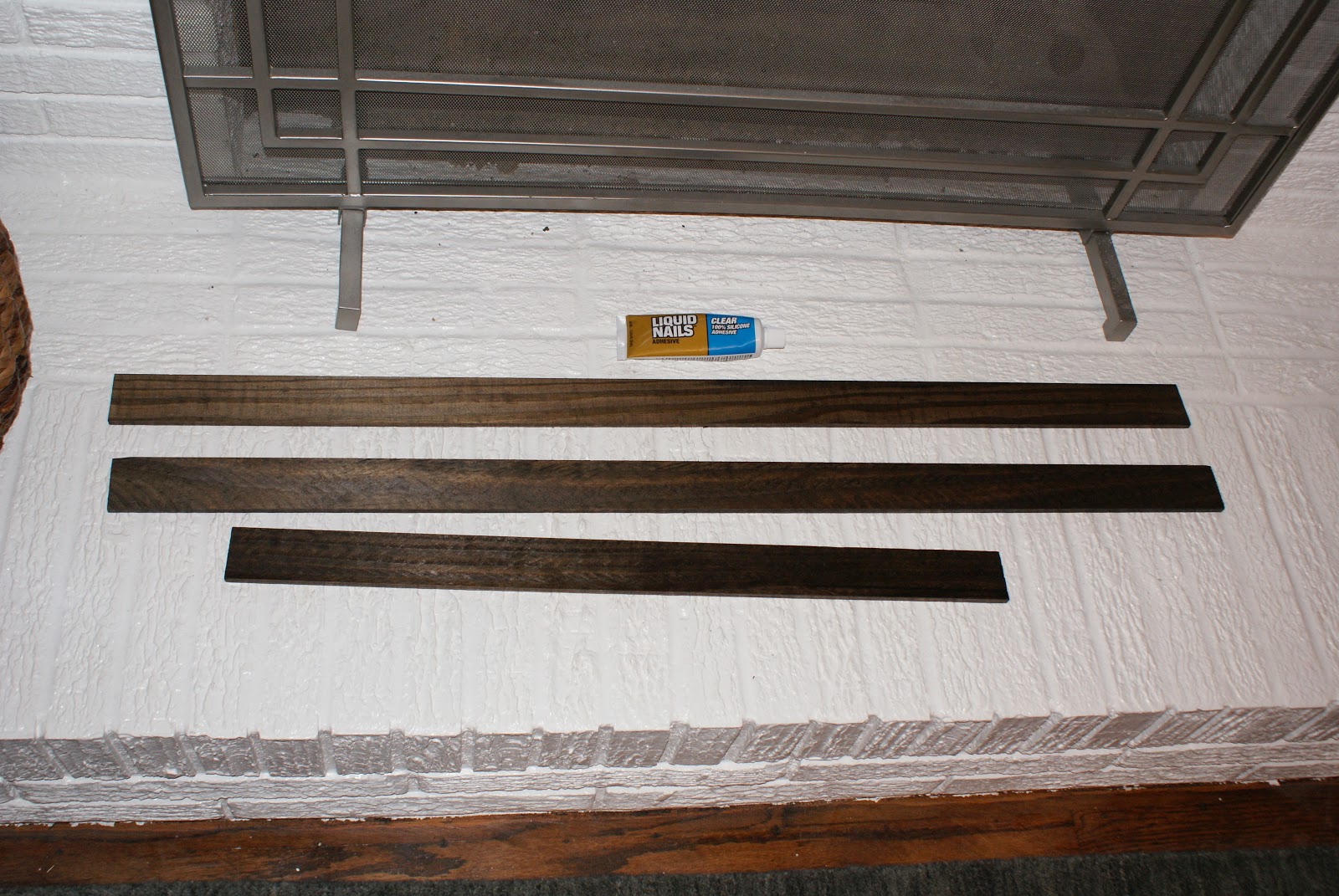
My goal was a simple, cheap, easy DIY frame with a clean, modern feel.  I picked up some wood in the trim section at Lowe's, cut it to size, stained it, and glued it to the canvas.


I'm definitely pleased with the final result.  It adds just enough definition around the artwork to make it visually pop off the wall a bit.  And making the frame was super easy (minus a few necessary tweaks along the way that I'll share below so you can learn from my mistakes).

Supplies:
  • Wood (I used two 8 foot pieces of 1/4 in x 1 3/4 in x 8 ft pine lattice moulding that I found in the trim section at my local home improvement store for $3.14 each.  My canvas was only 1 1/2 in deep but I just left the extra 1/4 in and let it hang off the back of the canvas.)
  • Saw (We used a circular saw, but a hand saw would work just fine for these short cuts.)
  • Sand paper (I used a fine grit.)
  • Stain of your choice (I used Minwax stain in Dark Walnut.)
  • Adhesive (I ended up using gorilla glue - see below.)
  • Clamps

Simple How To:
  1. Measure your canvas and cut your wood to size (You could miter the corners but that is too complicated for my taste.  I just cut the pieces for the top and bottom to the exact size of the canvas and then for the sides I cut the pieces long enough to overlap the ends of the top and bottom pieces.  Make sense?  I just added twice the thickness of the moulding onto the measurement for the side pieces to get my final measurement.)
  2. Lightly sand the cut ends and any rough spots on the lattice
  3. Apply your stain, let it sit until the desired color is achieved, wipe off, and let dry
  4. Glue the pieces around your frame and clamp in place while drying (I tried to use liquid nails at first, but it wasn't adhering so I switched to Gorilla Glue.  If you've never used Gorilla Glue before you should know that it expands a lot as it is drying.  Despite applying what I thought was a small amount, the glue expanded out onto the front of my canvas and I ended up having to use my x-acto knife to carefully chisel away the excess glue.)
  5. Hang it back up and enjoy your handiwork!

 Three of the four pieces stained and ready to go (or so I thought)


**Lesson Learned from Mistake #1: Stain both sides of your wood.  It is unlikely that your canvas will be perfectly square, and because of this, the bottom of some parts of the wood will show.  I had to remove my first board and take them all back outside to stain the backs.


**Lesson Learned from Mistake #2: Either don't use Gorilla Glue, use much less Gorilla Glue, or stand there and wipe it away as it seeps onto the front of your canvas. 

After carefully cutting and peeling it off, it was somewhat less noticeable.


Since the new frame is 1/4" deeper than the canvas, we had to pull the nails out of the wall a bit further so that the wooden part of the canvas was hanging on the nails instead of the new frame.  I guess this would also be a way to fake a deeper, more substantial-looking canvas if you had a thin one.


The stain on the entry console is more cherry than walnut, but I think they look alright together.  I prefer the walnut color, so I really didn't want to stain the frame to match the console.  Who knows how long the console will be with us, if I'll paint it one day, etc.  Speaking of the console, did you notice that we added one of the octagonal milk glass knobs to the front drawer?  I love the contrast and how it ties into the white on the bottom of our dipped storage baskets.


Obviously, the lighting in the first photo was much better - sorry.  We are experiencing an overcast day today.  Don't let that fool you - focus on the frame.  :)  The total cost for this project was around $15 because I bought a quart of the dark walnut stain.  If you already owned stain and just needed the wood, the total cost would be closer to $6.  I will definitely be using this quick and easy framing technique again in the future.

Wednesday, May 15, 2013

New Pieces for the Living Room

I'm back with a post about the new furniture and decor pieces in our living room.


One (or two) of our biggest additions is a pair of club chairs.  After months and months of browsing upholstered chairs online, Seth and I pulled the trigger clicked the mouse on these armchairs from Target.  I am pleased with their design and comfort, but I am a bit concerned about their durability.  All I can say is that time will tell if you pay for what you get with these chairs.  I'll let you know.


The side table is a Target find (no longer on their website).


I also purchased two poufs after eyeing them for many months.  I love them.  They are a blood red-orange color and give the room a nice jolt of energy.  They have actually inspired me to add more red-orange accents to the room and I am considering purchasing this or this throw pillow.  The poufs are filling the empty space between the coffee table and the fireplace hearth and are functioning perfectly as ottomans for foot-propping and as extra seating when we have guests over.


Another new piece is the small accent table on the built-in wall.  I found it at a local antique shop for a pretty reasonable price.  I'm still deciding if I will keep it as is, refinish and stain it darker, or paint it.


The fireplace screen is also fairly new.  We inherited one of those commonplace rickety black ones when we bought the house (see below).  The new one was on sale at Crate & Barrel a few months ago (I can't find it on their website anymore).  


Another minor change, is the addition of new knobs to the built-ins.  When we moved in, the knobs were painted to match the cabinets (an ugly cream color).  When we painted the room (including the cabinet fronts), we put some cheap wooden knobs on thinking that we would paint them to match the wall later.  At the time, I was just set on making the weird built-in cabinets blend into the wall as much as possible.  However, I have since decided to try some of the knobs we originally purchased for the kitchen cabinets (and are now using on other things around the house like our master bathroom vanity and the console table in the entryway) and I like how they look, so they're staying put.


I think that sums up the new living room furniture and decor.  We are still making progress slowly but surely in here (as with the entire house).  On the list are DIY'ing a console table for behind the sofa, possibly DIY'ing a new media console, filling and styling the built-ins, and adding art to all of the bare walls.  Whew.  Makes me tired just thinking about it.

Monday, May 6, 2013

The Living Room, It is a-Changin'

I mentioned a while back that we had finally nailed down a living room layout that was going to work for us.  The main challenges to arranging furniture in our living room are as follows:

  • it is long and narrow
  • it is asymmetrical - there used to be a window on either side of the fireplace but when the carport and storage area were built, one was closed up
  • there are built-ins on one wall and storage cabinets on another (so furniture cannot be placed in front of these)
  • there is a large fireplace (don't get me wrong - I love fireplaces; it's just that they limit the way furniture can be arranged)


My goals for the living room furniture layout were to:
  1. make sure that the fireplace was the focal point of the room
  2. avoid mounting the television above the fireplace (I absolutely hate televisions mounted above fireplaces for multiple reasons --> I don't want a TV to be the focal point of my fireplace/mantel area, there is no way to mount the television at eye level and this just leads to awful neck strain, I do not want to permanently drill through the brick in multiple places in a home that is not our forever home)
  3. create a cozy seating area that does not cut off the flow of the room
We have had the living room furniture arranged at least four or five different ways since we moved in nine months ago.  Here is a quick rundown of our trials and errors.


Layout #1
  • sofa on the long wall across from the fireplace
  • television on the wall with the built-in cabinets (cable hook up is on this wall)
  • chairs flanking the fireplace


Why it didn't work:
  • the sofa was so far away from the chairs that the seating area felt disjointed instead of cozy
  • we got tired of turning our heads to the left to watch television
  • there was a strange empty corner to the right of the built-in cabinets (visible in the first photo) which felt like unusable space


Layout #2
  • sofa pulled away from the long wall
  • television on the windowless side of the fireplace


Why it didn't work:

  • pulling the sofa off the wall created a seating area that was too cozy and one that was difficult to enter
  • it also created a narrow walkway through the living room (I felt like we should install a moving sidewalk a la an airport concourse behind the sofa)


Layout #3

  • this layout involved placing the sofa perpendicular to the fireplace wall
  • the television was on the wall with the weird built-in cabinets like in layout #1

I don't really have any pictures of this layouts, but you can kind of see in the photo below that we had the room laid out this way back when we painted the fireplace.


Why it didn't work:
  • the room is just too narrow and this layout again created a small walkway and chopped up the room in a strange way
  • the fireplace was less of a focal point now that the sofa wasn't facing it


Layout #4
  • the same as layout #3 but flipped around so that the sofa was on the other side of the fireplace and the television was over on the built-in wall (again, no pics, but see below for a depiction)


Why it didn't work:
  • pretty much for the same reasons as layout #3


Layout #5 (aka 5th Time's the Charm?, aka How the Living Room Looks Currently)
  • we moved the sofa back onto the long wall, but pulled it slightly away from the wall (enough to fit a thin console table behind it)
  • we moved the television to the windowless side of the fireplace (so as to avoid any neck strain while watching it)
  • we angled one chair on the side of the fireplace with the window
  • we placed the second chair perpendicular to the sofa and coffee table (but far enough back from the coffee table so as not to block the view of the television)
  • we added two bright poufs in front of the fireplace to take up some unused space and add extra seating


The only thing that is still bothering me is the length of the media console.  I feel that the living room now visually ends at the back of the chair at the far side of the room in the photo above, but the media console extends past that point and it seems odd (best visible in the third photo above).  We may have to sell it :( and buy or build a new one.

You may have noticed quite a few new things in the living room (or you haven't been paying that close of attention to our furniture, which is fine, too).  A post about the new pieces that we've purchased recently for the living room is coming.

In the meantime - yay for progress and finding "the" layout for our living room.  I hope.