Saturday, October 4, 2014

Building Porch Columns Part I

Do you remember our dark green, wrought iron, oak motif porch columns?  (That's a mouthful, isn't it?)  No?  I'll remind you.

They weren't really our style.  And they were looking even more out of place after we painted our front door and built our shaker-style shutters.  

BUT...not only were they clashing with our more modern style, they were rusting through.  Two of them weren't even functioning anymore.  A strong breeze would start them swinging.  I'm not exaggerating.

So we really needed some new porch columns - from an aesthetic standpoint and more importantly, from a safety standpoint.  

We considered going with a durable, waterproof option like fiberglass.  Until we saw the price. I've said it before and I'll say it again: this isn't our forever home.  We need to draw the line somewhere.  

So we decided to build our own out of treated wood.  


We went with a simple boxed column with trim at the top and bottom.   Here's how we did it.

Supplies per column (we used all treated wood):
  • 2x4s (to use as support beams)
  • (1) 4x4x8
  • (2) 1x6x8s
  • (2) 1x4x8s
  • (2) 1/4" x 2-1/4" wedge anchors
  • (4) 3" x 3/4" corner brackets
  • exterior wood screws
  • wood filler

Tools:
  • angle grinder
  • miter saw/chop saw
  • hammer drill with tapcon concrete bit
  • regular drill
  • measuring tape
  • brad nailer (or hammer and finishing nails)
  • hammer
  • socket wrench
  • palm sander

I won't give you a cut list because that is going to be pretty specific to each porch and each column, but I will tell you how we determined our measurements as I go along.

We started by bracing the porch roof with a couple of 2x4s.  We cut them a bit longer than the height of our porch and used a hammer to wedge them in.  Then, Seth used our angle grinder to detach the bottom of the wrought iron columns (unless it was already rusted through of course).

The tops of the wrought iron columns were secured with screws that had been painted over numerous times.  After a bit of patience, we were able to unscrew those bad boys and the green columns were gone.


We cut our 4x4 post to the correct length and set it in place.


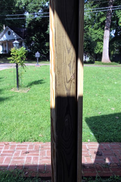
We made sure it was as square as possible and then used our corner brackets and wedge anchors to secure the bottom of the post on the front and back sides.  (*NOTE: We used our angle grinder to cut one of the holes off every corner bracket.  This shortened side is what we used as the side that was secured to the porch floor.  Otherwise, the bracket would have protruded out past our trim.  See third pic below.*)  First, we held our corner bracket in place and marked the hole with a sharpie.  Seth then used our hammer drill to drill down into the brick.


Then, he hammered in a wedge anchor.  (For those that haven't used these before, leave about 1/2" above the surface for you to attach your hex nut.)


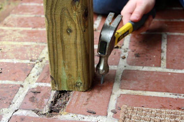
Place your corner bracket and then your hex nut over the top and tighten with a socket wrench.

*See how there are two holes on the post side of the bracket and only one on the brick side?

We also used the corner brackets and exterior wood screws to secure the top of the post to the porch header on two sides.  (Ignore the fact that we had already started boxing in the column in this shot.)


We continued to remove all of the wrought iron columns and install the 4x4s in their place.

Then, it was time to use our 1x6s and 1x4s to box in our posts.  We centered a 1x6 on the front of our first post and used exterior wood screws to attach it.


As you can probably see in the photo above, we purposely cut the 1x6 short so that it would end above our hex nut/wedge anchor.  This gap will be covered with trim later, so it won't be visible.  You could also measure and notch the bottom of your board if you wanted it to extend the full length.

Then, we continued boxing in our post by attaching 1x4s to the sides.


We then attached a second 1x6 to the back trying to keep things as square as possible.  You may have picked up on the fact that this means our columns are not a perfect square.  (A 1x6 is actually 3/4"x5-1/2" and a 1x4 is 3/4"x3-1/2" so our columns are 5-1/2" wide by 5" deep.  We decided that was close enough for us.)


We continued around the porch, boxing in all four of our posts.


And then we took a break before moving on to the trim.


Isn't the difference amazing already?!?

Since this post is already pretty long, I'll leave you here for today.  I'll be back soon with the rest of the tutorial and some pics of the finished columns.  Have a great weekend and enjoy the fall weather!

Wednesday, September 17, 2014

Radio Silence and What I Love About Fall

I apologize for the lack of posts recently.  Things have been busy around here and we had a project setback this past weekend (I'll share the story with you in a future post).

I did want to pop in and stir up some excitement about my favorite season.  FALL IS ALMOST HERE!!!  I've got some ideas for our fall wreath and fall mantel.  I just need to find time to start crafting.  I'm hoping to get moving and share some finished pics with you soon. For now, let me leave you with a roundup of images depicting some reasons that I love fall.


What are your fall favorites?  Happy Thursday and War Eagle!

Monday, September 8, 2014

Updated Whole House Color Scheme

The last time I showed you our house's paint colors was back in January of 2013.  Wow - I can't believe it has been two years.  Back then, it looked like this:

Since then, we have painted over the navy blue accent wall in our master bedroom, added gray stripes to our master bathroom, painted the kitchen walls and ceiling, and most recently repainted the office and dining room after switching their duties.

Today, our house is looking more like this:

I'm finding that I really like soft, neutrals on the walls and adding pops of color in through artwork and accessories.  After two years, we now have a better idea of how to tweak this house to make it work best for us.  I'm happy with where this house is headed.

Saturday, August 30, 2014

New Dining Room Wall Color

I know I kept you in suspense after my last post.  I went back and forth on what color to repaint the dining room.  The sesame was just too bright and "in your face" for relaxed digestion.

It was cheery in our old office, but it was time for a change.  I considered Benjamin Moore's Woodlawn Blue (what we have in our living room), Benjamin Moore's Hale Navy on an accent wall or a half painted wall like this, or Valspar's Polar Star (what's in our entryway/hallway).

I decided to go with the Polar Star.  

(Sorry about the blown out windows.  One day I'll read this tutorial and fix those for you.)

Here is what it looks like from the new office.

I think the Polar Star was the right decision to help achieve the light and airy look that I'm going for.


So the dining room walls were coats #7 and 8 of our eight coats in eight days painting extravaganza.  

I'm going to work on an updated whole house color scheme post for you.  And I need to introduce you to our office rug and my new desk!

Have a great Labor Day holiday!

Tuesday, August 26, 2014

Paint, Paint, and More Paint

Eight coats of paint in eight days.  In only two rooms.  I don't ever want to relive it.

When we decided to flip flop the office and dining room to better suit our needs, I knew that I also wanted to change the wall colors in these two rooms (much to Seth's dismay).  You may remember that I was leaning towards white walls a few weeks ago.  Well, I decided that I also wanted a light blue ceiling.  

So, Seth and I took a bunch of our light blue paint samples and dumped them into a paint can with some leftover white paint.  I felt so resourceful.  We made the icy, light, grayish blue that you see in the roller tray above.

But then we started rolling it onto the ceiling and it looked completely different.


What the heck?  Painting this room baffles me.  Then we thought, 'Maybe the blue walls are reflecting off the ceiling and causing it to appear more saturated than it really is.'  So we used a piece of white poster board to cover part of the wall.  But it was really hard to tell if it made a difference.  So, we decided to stop painting the ceiling and tackle the walls first.

Now, I really loved the Wedgewood Gray.  But the white walls really brighten the room (I think that's two coats in above).  It was kinda shocking to me how much brighter it got.  We used Valspar's Ultra White (formerly Anthem White) which is the same color as our bedroom.  
It took one coat of high hiding primer and THREE coats of Ultra White.  I had hoped that the "high hiding primer" would help us cut down on the number of coats needed but I guess not. Lesson learned: white paint does not cover well.  That's probably obvious to most of you, but it wasn't to me.

Now back to the ceiling.  Amazingly, I picked up some paint swatches from Lowe's and immediately loved Valspar's Stillness.  


It ties into the artwork in the entryway and the print that I ordered for above my desk.  And it is such a soft, soothing color.

The ceiling took the normal two coats.  For those keeping track, we're up to six coats.  The other two were for the dining room walls.  I'm going to leave you hanging and reveal the new color in my next post.

The positive news - I'm now a pro at cutting in.

Thursday, August 21, 2014

Kitchen Plans and a New Wall Oven

I just realized that it has been a year since we've made any progress in the kitchen.  A year, people.  Time flies by and there are so many projects to tackle that the kitchen just hasn't progressed.  But that's all about to change.  We are dedicating all of our spare time during the entire month of October to the kitchen.  It's about to get real.

Remember this mood board?

Our Kitchen

I am still going for something along these lines.  And I am still having a difficult time deciding on a cabinet color.  I will say that some, if not all, of the cabinets will be white.  That is all I know for sure.  The feather imprint knob from Anthropologie (#4 above) is no longer an option for two reasons.  First, it is no longer available.  More importantly, it's too large.  Also, the amazing wood table from CB2 has been gone from their website for awhile.  Sad.  I'm trying to convince Seth that we should just build our own.  I like this one.  And I think it's a doable DIY.

What we have done in the last few months is purchase a new wall oven.


When you have a tiny space for your wall oven and can only fit a 24-incher, you have few options.  When you are on a budget but really want stainless steel to match your other appliances, you have even fewer options.  


So, needless to say, this wall oven was my first choice for our specific situation.  It is not my dream oven.  If we had an endless supply of money, I would have chosen this for our space. But saving around $800 was more important to us.  And, as I've mentioned before, we don't see this as our forever home so we are trying to make wise choices.


On to the positives.  It plays nicely with our other stainless steel appliances.  It bakes evenly!  It is slightly roomier inside (our old wall oven had thicker walls that ate into the inside square footage).  It has a working clock.  And timer.  And OVEN LIGHT!  I feel so spoiled.

Yes.  It's already dirty.

I will give you one fair warning if you're oven shopping.  This model has a fan (that I believe mostly helps it cool down, but that another reviewer mentioned helps circulate hot air for even cooking) that makes a fair amount of noise while running.  It isn't "loud" per se, but it isn't quiet. It doesn't really bother me but there are enough people who mention it in their reviews that I thought I'd disclose that info here as well.

Just squint your eyes and imagine clean, white cabinets with brushed nickel pulls, a subway tile backsplash, and a gray tiled floor.  And maybe a pop of color on our carport door.  Soon.  Very soon.

Thursday, August 14, 2014

Organized Nightstands and Artwork

We're popping back into the master bedroom today so that I can show your our new artwork. You may remember that way back in April, I shared a mood board detailing the new direction for our bedroom.  It included four prints that I planned to hang above our nightstands.  Well, four months later, they are finally gracing our walls.

For my side, I chose an out of focus photography print from Minted.  It's called autumn obscured.  

I love its abstract feel.  And the colors are perfect.  I ordered it with the modern white frame.


The other print is a cute ampersand from Jones Design Company.  I popped it into a square silver frame from Target that I had on hand.  


I also added a mother in law tongue that I picked up at Wal-Mart and planted in a mercury glass vase.  My glasses sit in a small wooden tray that I found at Marshall's and I purchased my iPhone dock from CB2.  

The small floral frame contains a picture of me and my grandmother that I inherited after she passed away and I haven't changed the frame since she chose it to put our picture in.


Over to Seth's moodier, more masculine side.


He approved the antelope squirrel print (which we lovingly refer to as the squirrel-a-lope)...


 and Clare Elsaesser's November print for his side.  The white frame is from Wal-Mart and the other one is another square silver frame from Target.

I forced him to get a new alarm clock.  (I just searched to find you a picture of his old one but I apparently edited it out of my photos.  For good reason.  It was similar to this.)  


I also built him the wooden storage caddy for his kindle and iPad to sit in.  His nightstand is definitely looking more streamlined now.  But he is pining for his old alarm clock.

It's nice to finally have some art hung to liven up the white walls.  


And the addition of a live plant makes me happy every time.


Hope you have a great weekend!